Interior decorating ideas play a major role in the sell of any home, in this uncertain real estate market , even more with the addition of all the new foreclosures. The top selling features of a home are kitchens, bathrooms, master bedrooms, outdoor living spaces, and curb appeal. These features are what today's home buyers are comparing when shopping for their new home. The key question to ask yourself is, if you really want to sell your house, and does it still have your personal signature? The moment the house goes on the market it belongs to the future owner. Sorry, this sounds cruel, but its time to pack up, and move on, it's not your personality, this is business.
Mark it sold, by giving back its identity, you must remove everything personal from the house. Here's a list of items for elimination, photos, dated or shop worn furnishings, toys, garage clutter,themed rooms, wall paper, red, bright or dark colors, personalized art work, have carpets professionally clean or replaced, yard maintenance and repair anything that is damaged.
Now that the home is has been unpersonalized we can address room colors, a fresh neutral palette will relate to most buyers, a cooler color schemes make rooms appear larger, with the use of the lighter color spectrum especially in bedrooms. Lighter yellows, beige's, and soft greens are prefect kitchen colors, and a fabulous design technique is to bring the outdoors in through the use of a color.
A good designer knows a clients concerns, and right now your thinking, more time, additional money, but consider six months to a year on the market, and still your home hasn't sold. You might agree that a few of gallons of paint, and some muscle power doesn't seem quite so insignificant in comparisons.
Spaces always show better when styled as room settings, utilizing your own, borrowed, or rented furniture and accessories. Recall, only the personal elements were stripped away, your buyers should be able to imagine themselves living in the home. Every room is important, smaller spaces require less furnishings, larger rooms need more, bedrooms vary in size, and the master bedroom will need more attention.
Lets began room by room starting with the entry, neutral walls, entry table, desk lamp, vase, and generic art work, do not include, area rugs, mirrors, or clocks. Typically we interpret an area rug is used to cover up a flaw, mirrors only reflect tired home buyer's faces, and the presents of a clock will put a time limitation on the viewing time of your home.
The dining room soft taupe, green, burgundy, on walls are excellent color ways. The room should convey an intimate, and entertaining ambiance. A smaller dining area will require a walk around space in order to feel larger, place the host and hostess chairs on ether side of a window or left and right of a side board. A large framed mirror will reflect the chandelier adding depth to the room. On the side board, group candle holders, a plain bowl, or simple coffee service. A fresh orchid plant in a porcelain container, and a pair of botanical art pieces on the wall provide an elegant, and inviting touch. A neutral colored panel styled draperies as window treatments will finish the room nicely.
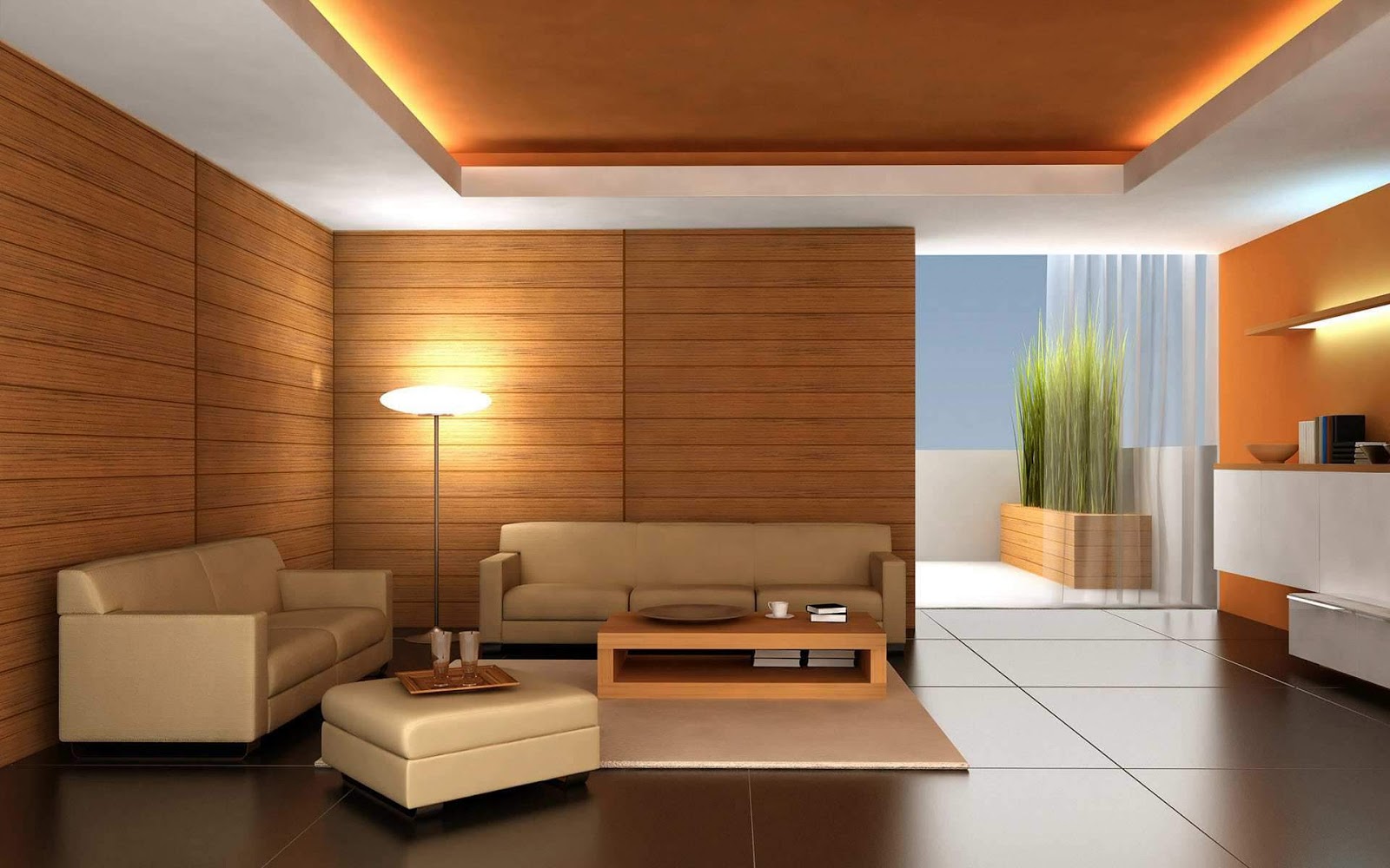
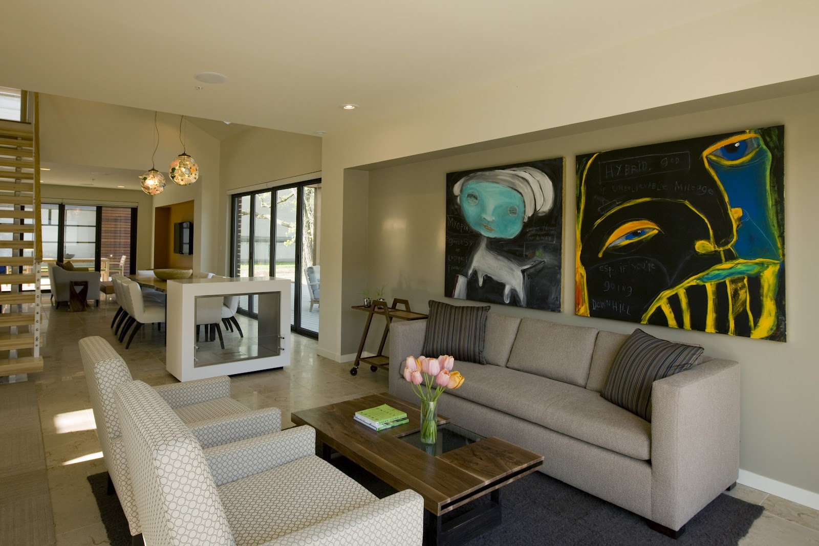
The living room, neutral walls sofa, two chairs cocktail table end table with table lamp area rug will anchor the furniture, table and floor lamps, art work ,decorative box or a set three candle sticks on the cocktail table, simple under stated drapery, or top treatments.
The kitchen and family room are usually connected, warmer walls pale yellow ,soft green, minimum window treatments or bare, brighter, cleaner, better. Clear counter tops free of all appliances, and other kitchen aids, by doing this it creates the allusion of more work surface, add bowls of fruit or vegetables, and remove any accents on top of the cabinets.
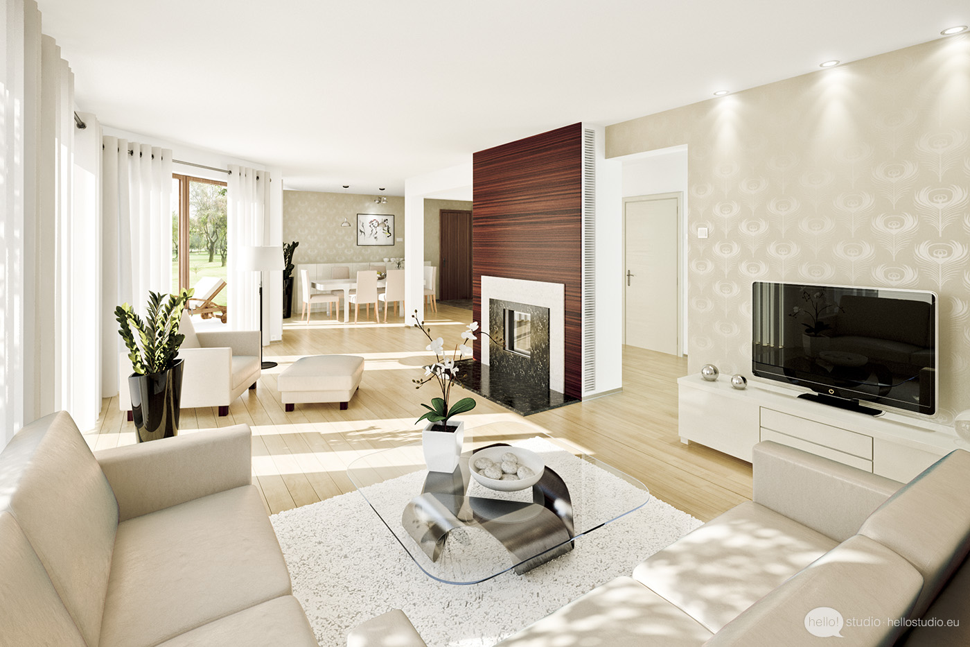
The family room visually must be warm, cozy, and inviting. Furniture should be functional, a sectional, or two small sofas, one chair, and ottoman as a cocktail table, tray, end tables, and lamps. If the room has a fire place treat as the focal point, and arrange the room around it .
On the mantel display large plate on a stand, or a glassless piece of art, tall candle holders, and a stack of books, three to five high, A symmetrical styling is less formal. Warning, the top design mistake made is, a mirror that is hung above the fire place, it directs the eye away from the focal point, and draws attention to the ceiling fan, upstairs cat walk, or dishes in the kitchen sink.
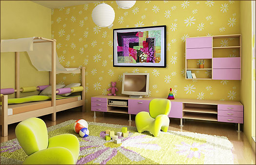
The master bedroom, neutral walls, bed, plain elegant bedding, side tables, lamps, dresser with decorative framed mirror, chair, and drapery panels at the window. The secondary bedrooms and bathrooms, use pale cool paint colors on the walls, and expand the room size visually. A twin size, or day bed, chest and desk with chair and top treatments on the windows. Treat all of the bathrooms consistently votive candles, folded towels, potted orchid, and simple floral or graphic framed art.
We have discovered that believing a buyer whom shares in your personal taste, will never come your way. The home is now a inviting living space, move in ready, and more attractive to a wider consumer base than before. Transformation only occurs when the directions on how to sell your home are followed. A valuable, and not so easy lesson to learned, the house is sold only, when the homeowner becomes the seller, allowing the buyer, the opportunity to dream.
You have read this article home interior ideas /
home interior ideas 2014 /
home interior ideas for bedrooms /
home interior ideas hd /
home interior ideas india /
home interior ideas pinterest /
home interior ideas uk
with the title Home Interior Ideas. You can bookmark this page URL http://vitaminedelamode.blogspot.com/2014/01/home-interior-ideas.html. Thanks!


